Archigram Zine
Archigram was published from 1961 to 1970 by recent students of the Architectural Association in London. This informal, cheaply produced magazine was a direct response to the dominance of modernist professional journals in the field of architecture. Archigram gathered images and ideas and created an outlet for new proposals that it circulated, creating new architectural vocabulary, and an understanding of architectural drawing as something other than just directions to get things built. Archigram also offered visions of the future and explorations relating to science fiction and pop culture. By studying archived issues of the magazine, I was able to identify important aspects of the publication’s material form, content, and means of production and apply these models toward a publication of my own.
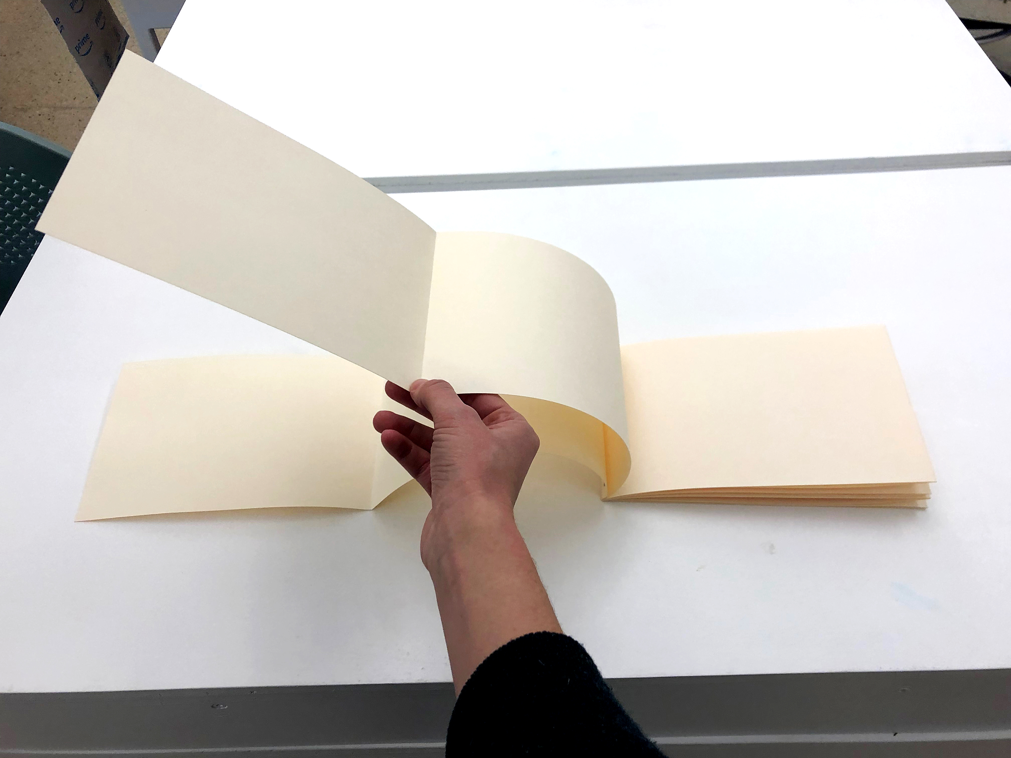
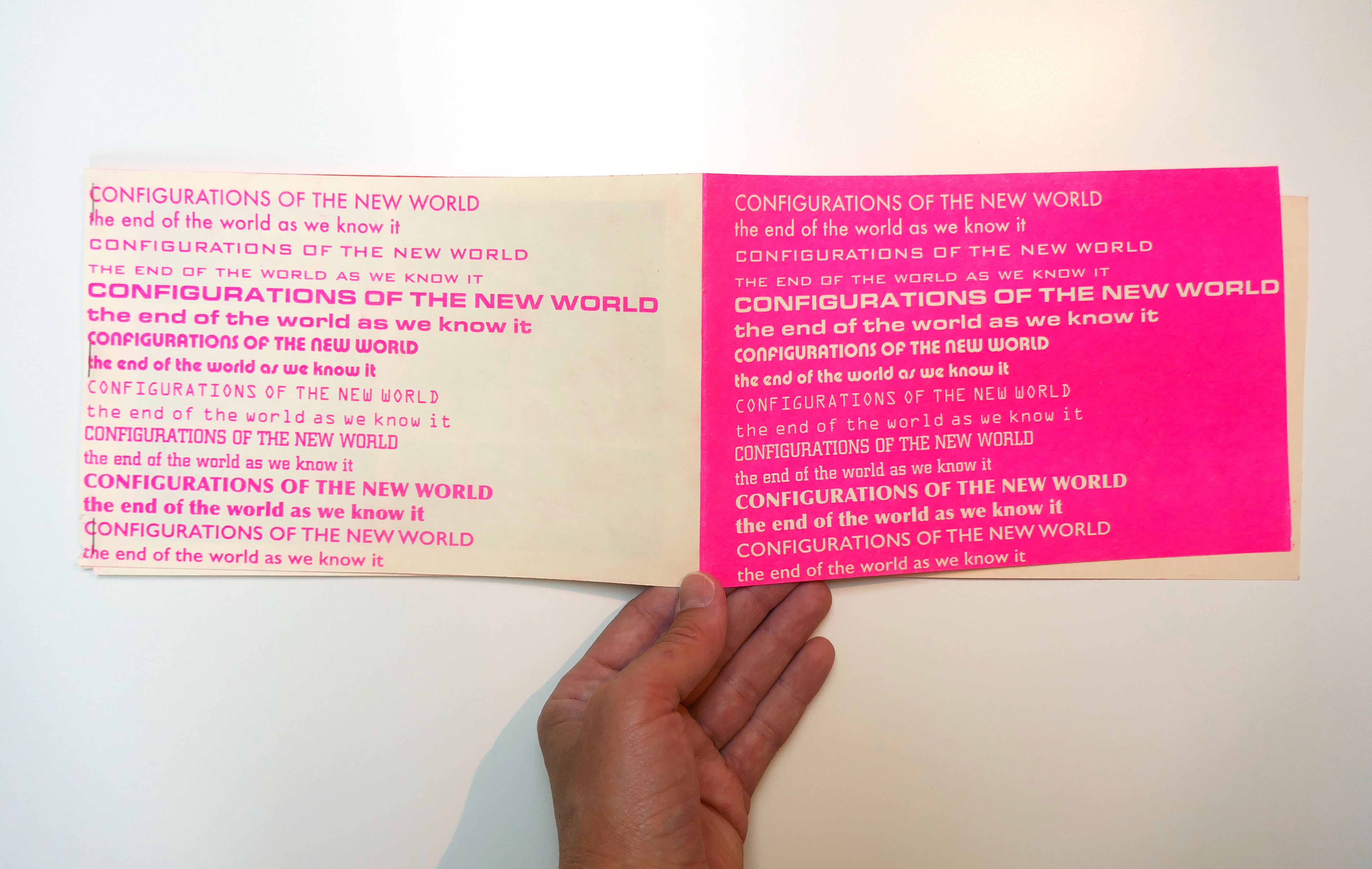
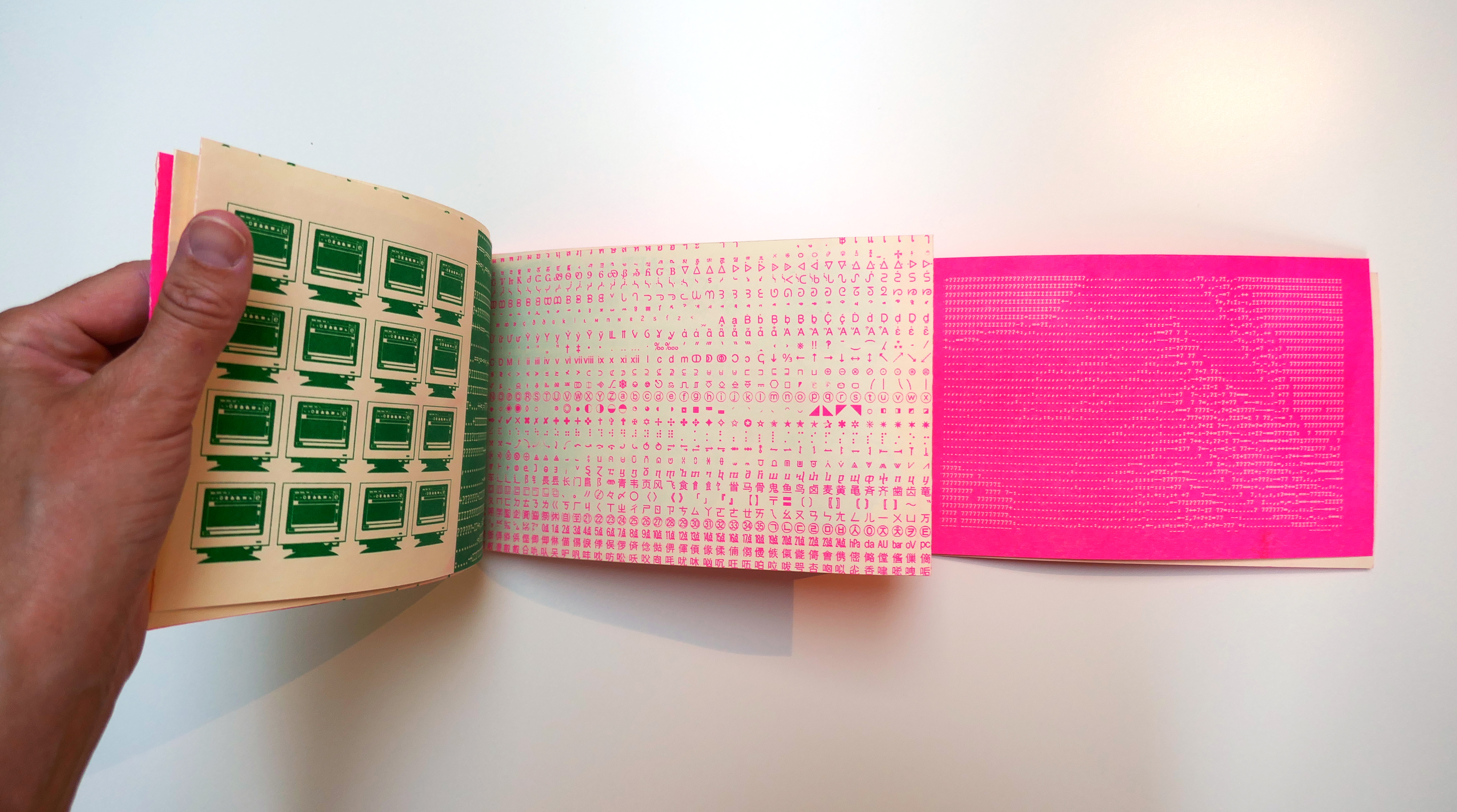
I decided to use the Riso to print my publication, connecting to certain aspects of Archigram, such as the use of color, as well as quick and cheap means of reproducing text and image without concern for print quality or readability being at the forefront. While the format of Archigram changed with each issue, I decided to borrow a concept from issue 9, which incorporated larger pages stapled along one edge that fold out, showcasing larger illustrations and resulting in a form that can be read in different ways (back to front, front to back, or perhaps unfolding a middle section to begin) resulting in a lack of hierarchy in how the information on the pages could be read. Several issues of Archigram play with this non-hierarchical concept, some even going so far as to be a packet of loose sheets, which can be reordered or rearranged at will.
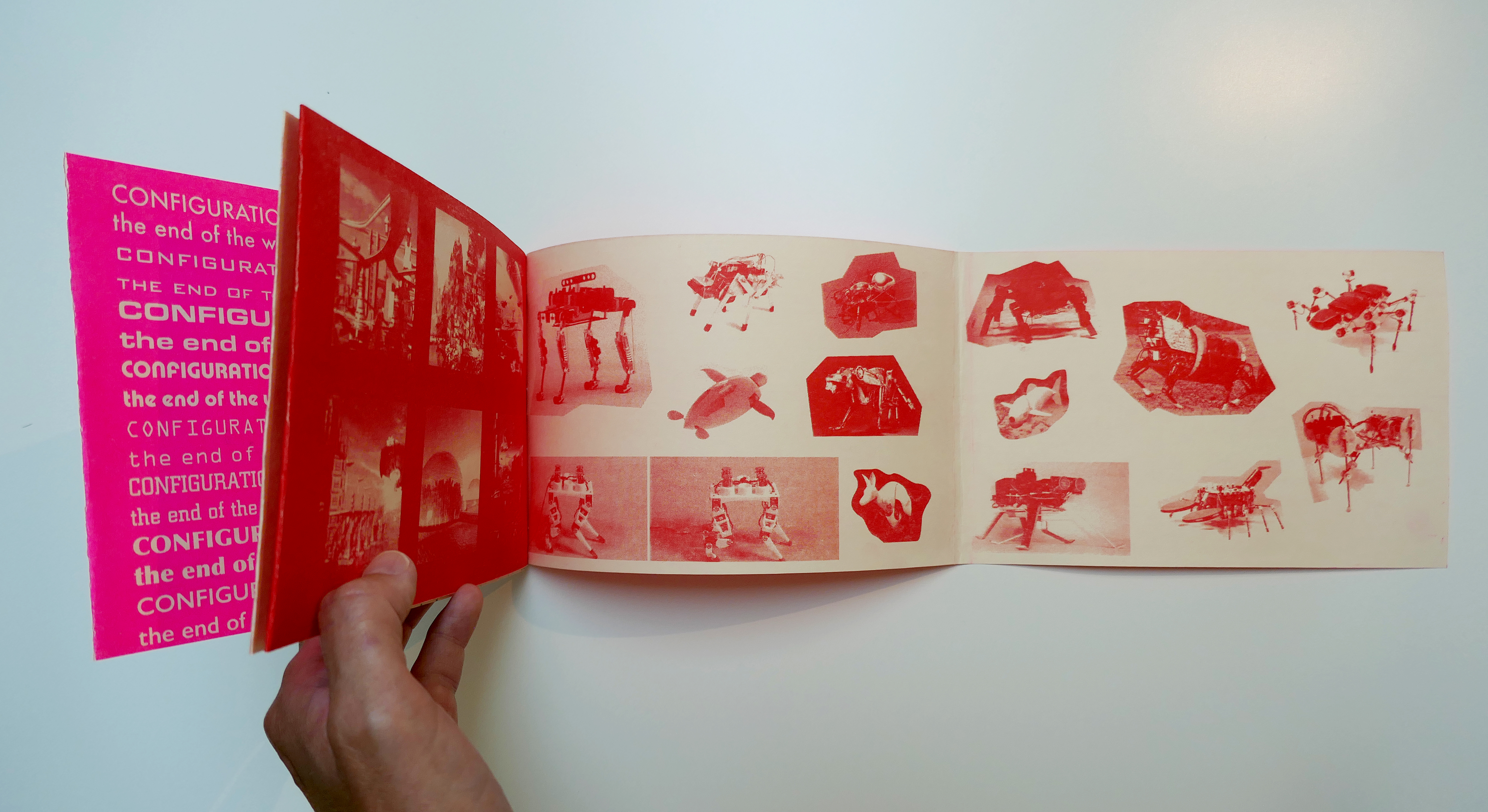
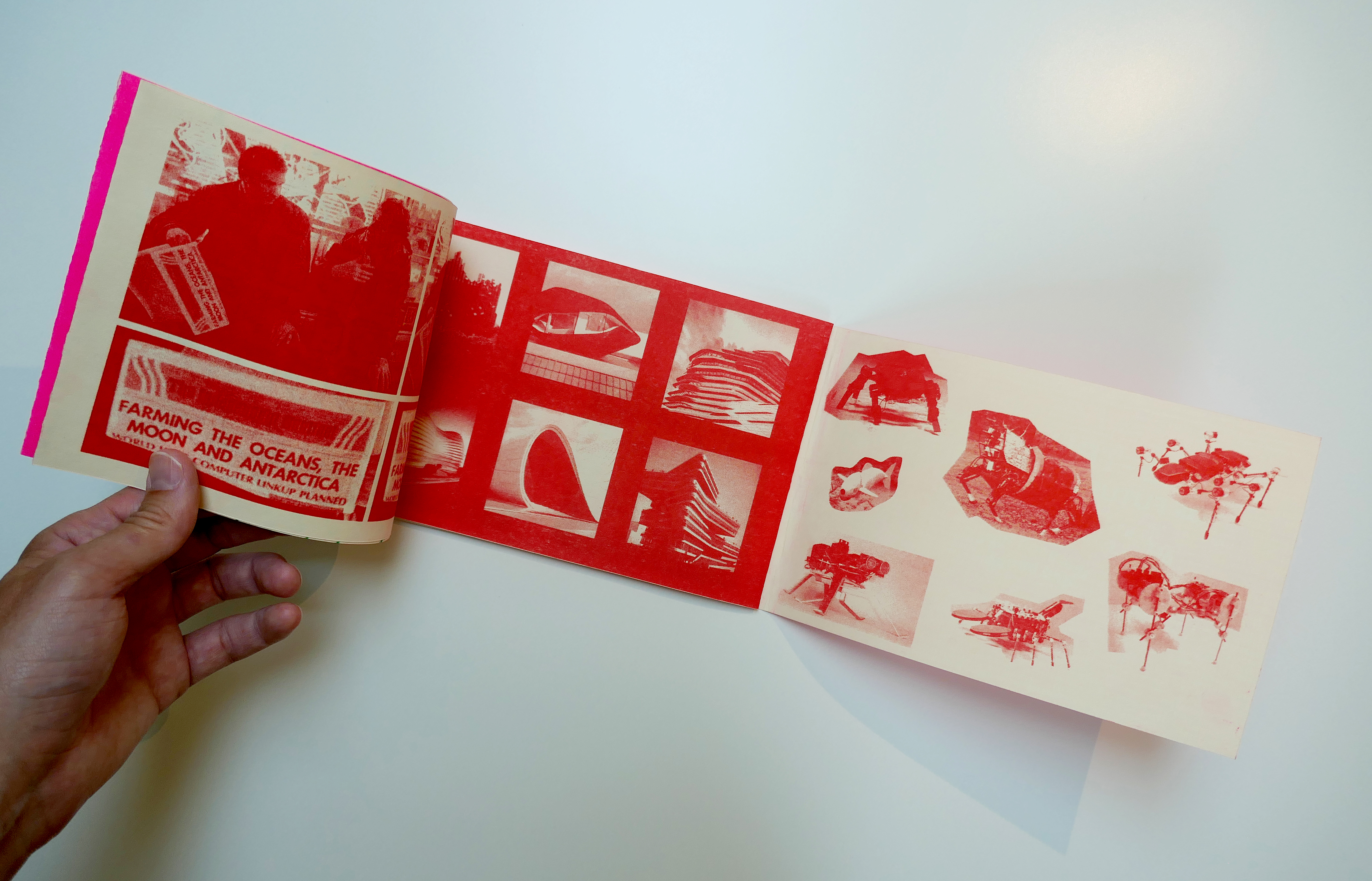
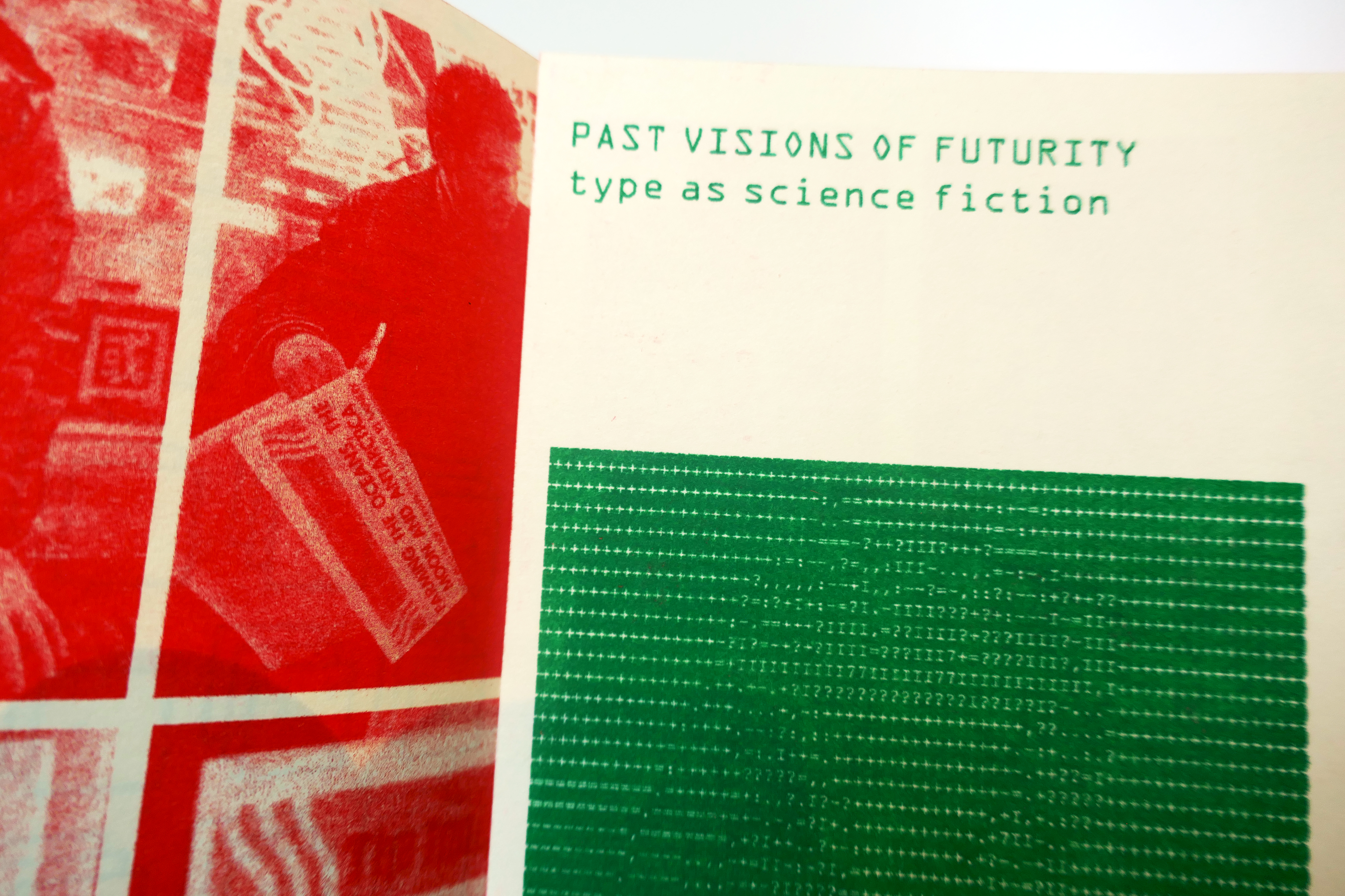
For the content of the publication, I wanted to choose something that related to the futuristic visions transmitted by Archigram. I wanted to be able to draw diverse source material together, considering a subject in different ways through combinations of image and text, and experiment with layouts. I was also inspired by issue #4 which examined science-fiction and science-fact, and wanted to tap into the sci-fi interests of Archigram.
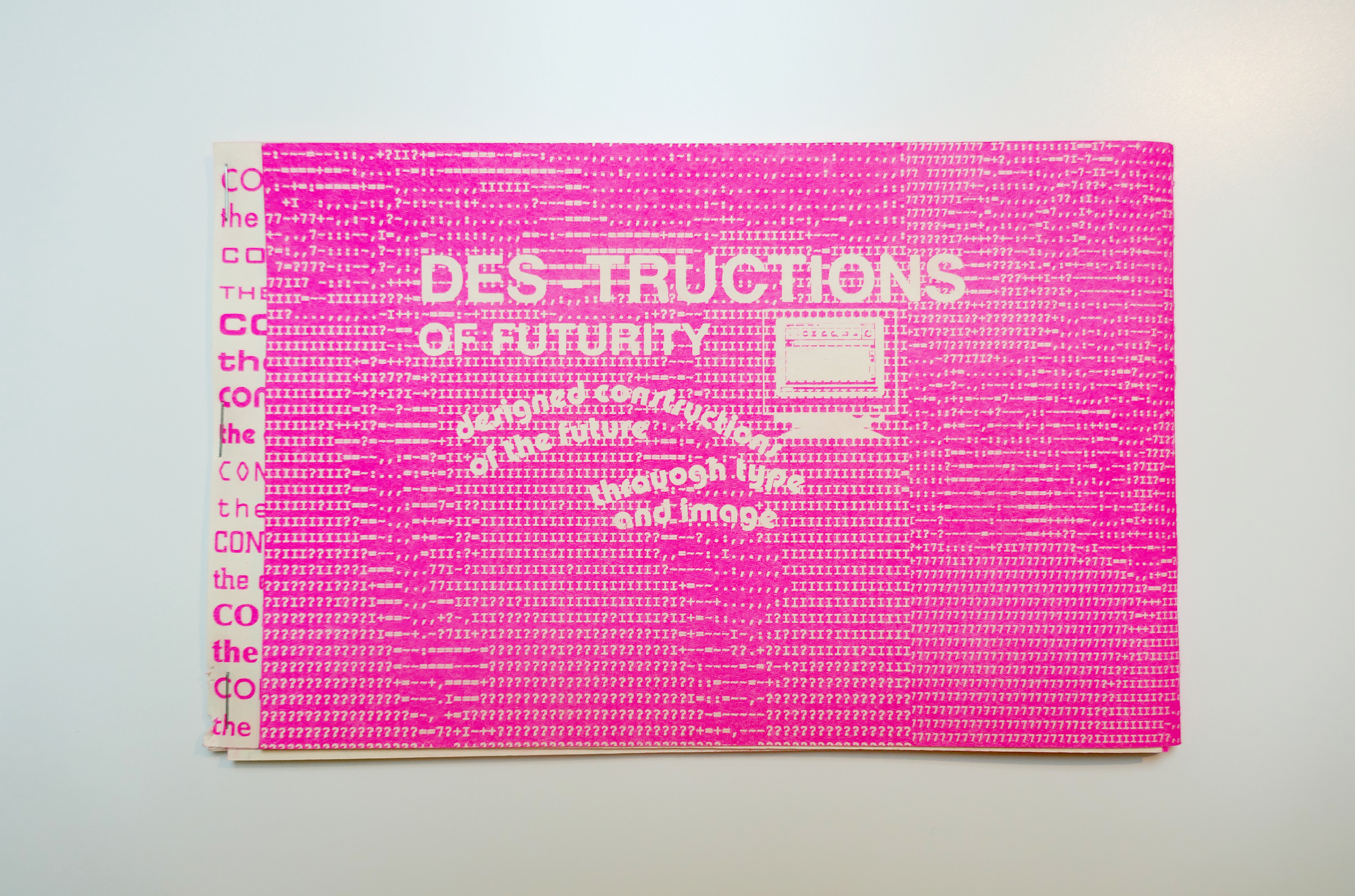
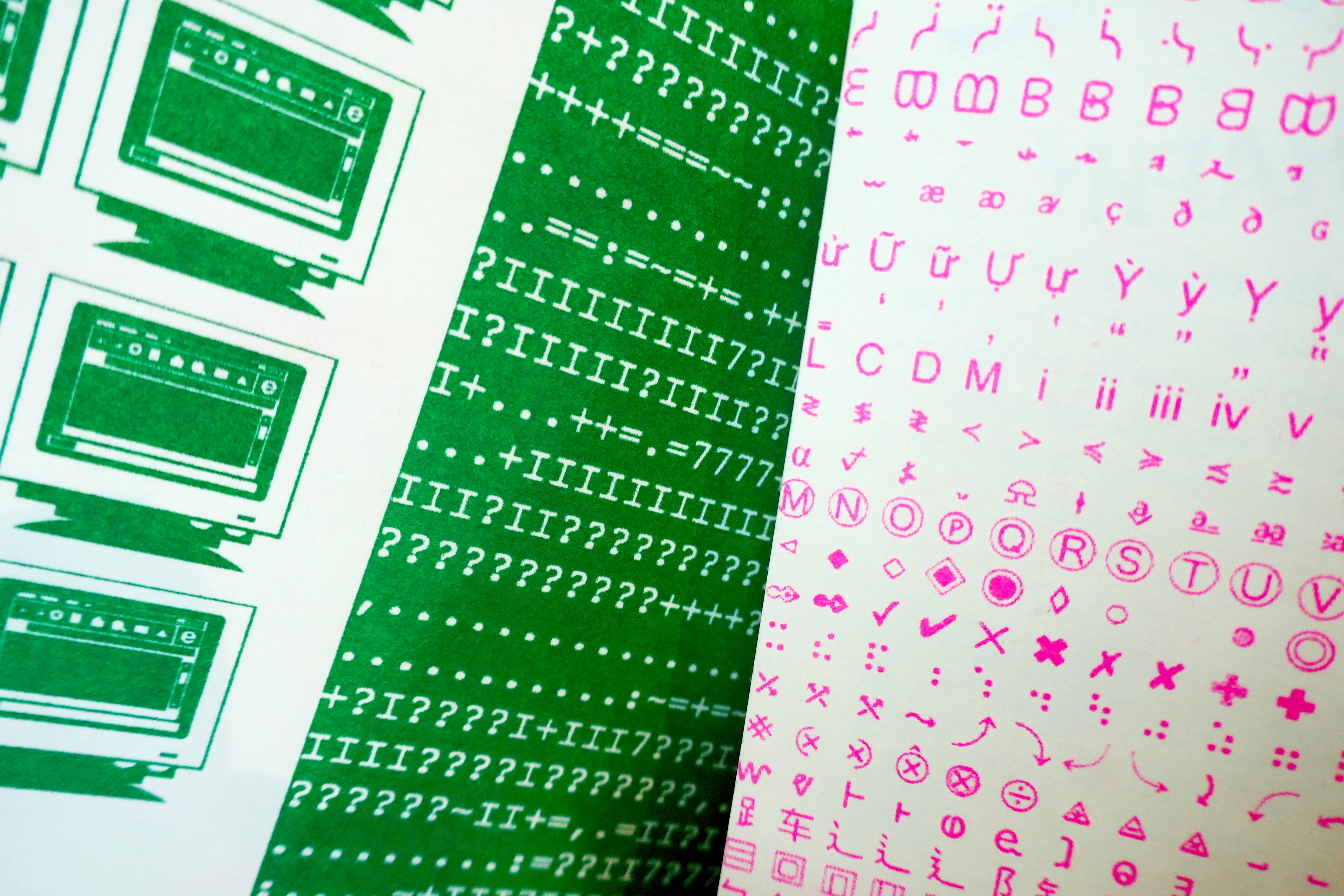
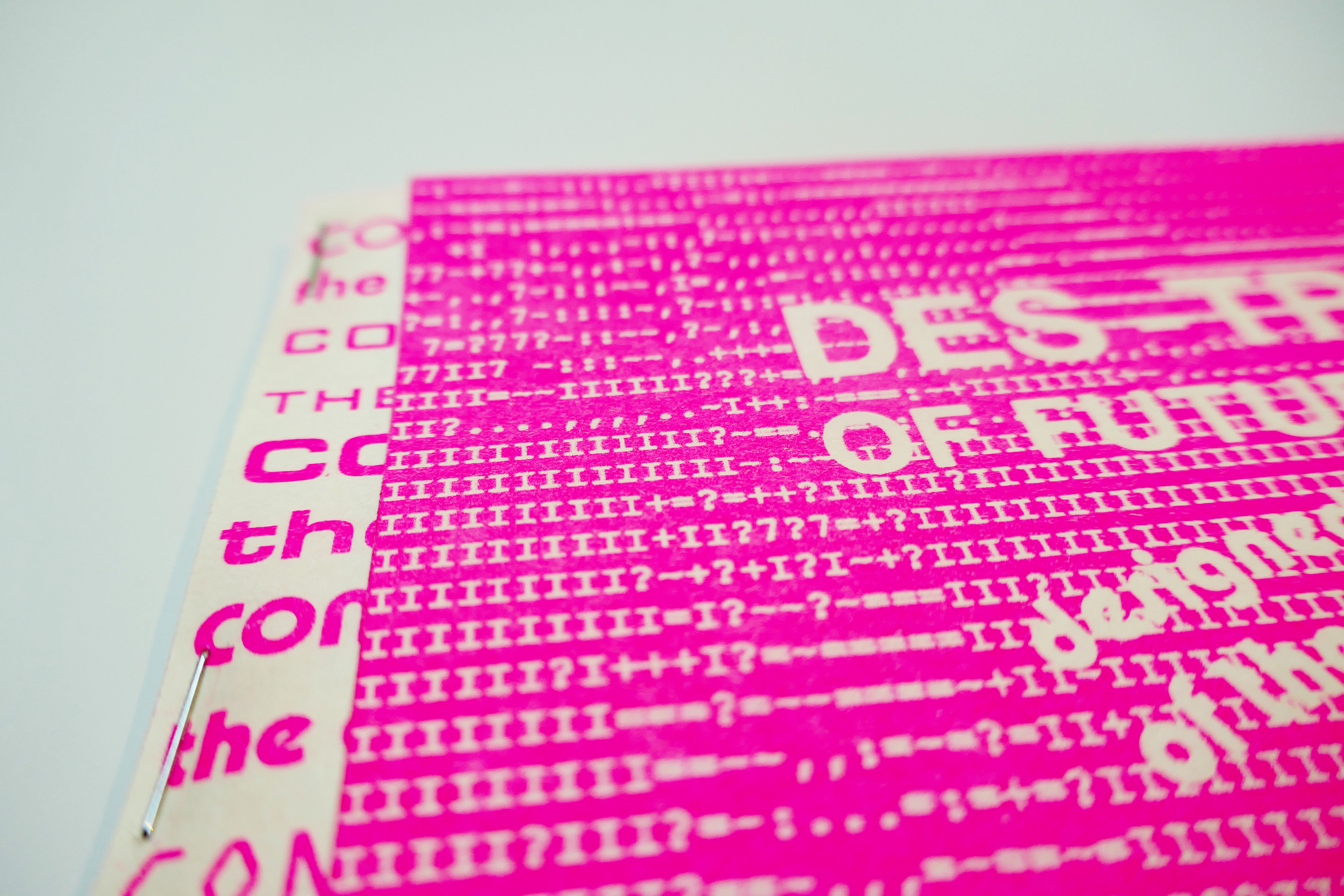
My publication centers around visions of futurity, as conveyed through type, technology, and science fiction, as well as ways the future has been conveyed and constructed in the past. I began looking at typefaces that evoke “futurity,” compiling a list of those used to indicate the future in classic science fiction films. In addition, I compiled glyphs, Unicode symbols, ASCII-generated images, and collaged photos that contribute to this narrative of constructing the future through imagery and type. What I found interesting, was not just the type, but recurring themes such as the omnipresent corporate branding in multiple films, suggesting the sinister role of corporate entities that became part of these futuristic visions. The title of the publication: “Des-tructions of Futurity” is a humble attempt at recognizing Archigram’s creation of language, their own title combining two word roots, and referencing the act of transmission of their architectural ideas. My title combines design and construction, referring to the act of building a futuristic environment through design...and also reads “destruction,” alluding to the dystopian settings typical of science fiction.