

Desk as a Stage
In the Fall of 2018, we took a course which explored the role of a designer as an archivist—a Master’s of Design core studio. For the first half of the semester, we explored the private archival materials of Nancy Emmons, a member of the International Design Conference in Aspen (IDCA). The IDCA began in 1951, and the materials in the archive begin there and go up until 1986. According to the Finding Aid, there are “cassette and reel-to-reel tape recordings of the conference for the years 1962 to 1982, as well as program booklets, scholarly articles and advertising materials. There are also posters and newspapers from the conference.” We were prompted to explore the archive and allow the content to drive the form of our design work.
The IDCA was a design conference—now called the Aspen Design Conference—that brought together the design world and their business counterparts. The founder, Herbert Pinkze, believed that a multi-day conference centered around an exchange of ideas from the two sides would result in a flourishing partnership and better integrate design into the business world. Some of the most iconic designs came to be within a corporate setting—such as Saul Bass’s AT&T logo and Paul Rand’s IBM logo. These two are giants in the graphic design world and it was rising stars such as these two who helped found and grow the conference.
In tandem with the physicality of sifting through archival materials, we read a wide array of perspectives on archival work as a practice. This included work by Allan Sekula, Walter Benjamin, James Sloan Allen, and Hal Foster, among others. Our goal was to think critically about what we found in the archive which would then dictate how we might present the materials to our audience—the task was to respond to this collection of archival material through a design gesture, and to contribute to a larger conversation.
The first step was actually sitting with the boxes of archival materials and looking through every piece of paper. The tactility of the paper itself was a joy to encounter—especially not having had personal experience with a typewriter and carbon copies. How would our perspective in approaching these objects as not mundane, quotidien objects, but foreign and precious, affect our navigation of the archive? Experiencing the current rhetoric of “Make America Great Again” which harkens back to the 50’s, perhaps heightened our own critical perspective and drive to expose the masculinist domination of both the time period and the particular field of graphic design. Additionally, our presentist perspective could be an asset, not a hindrance. How have a group of design students come to understand the 1950s and 60s, as people born in the 80s and 90s? Instead of fearing ignorance since we “weren’t there,” we could perhaps launch a new, and different conversation.
Working in a group of four, we were struck by the sheer amount of printed correspondence. As millenials who receive countless emails a day and partake in the debate of whether or not an inbox is kept at zero, or allowed to amass unread emails in the thousands, the physical nature and labor of correspondence itself was incredible. It also far outweighed other document types within the archive. In this way, we wanted to create something that could not have been done without the experience of this particular archive, even though there are many more IDCA archives. By studying the correspondence within the archives, we were able to identify the key figures of the 1950s and 1960s design world, and imagine the invisible labor of secretaries and other organizers of these events.
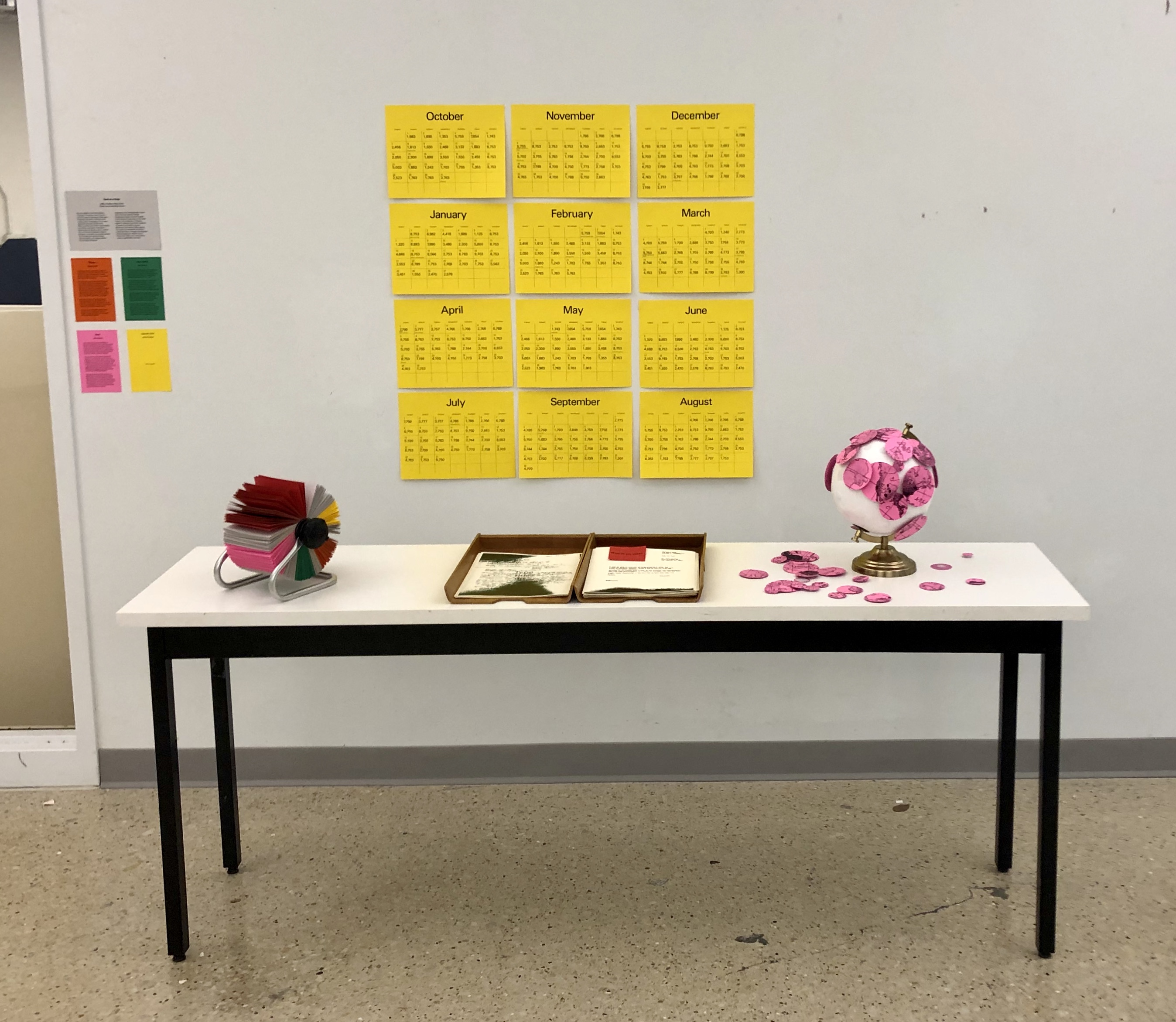
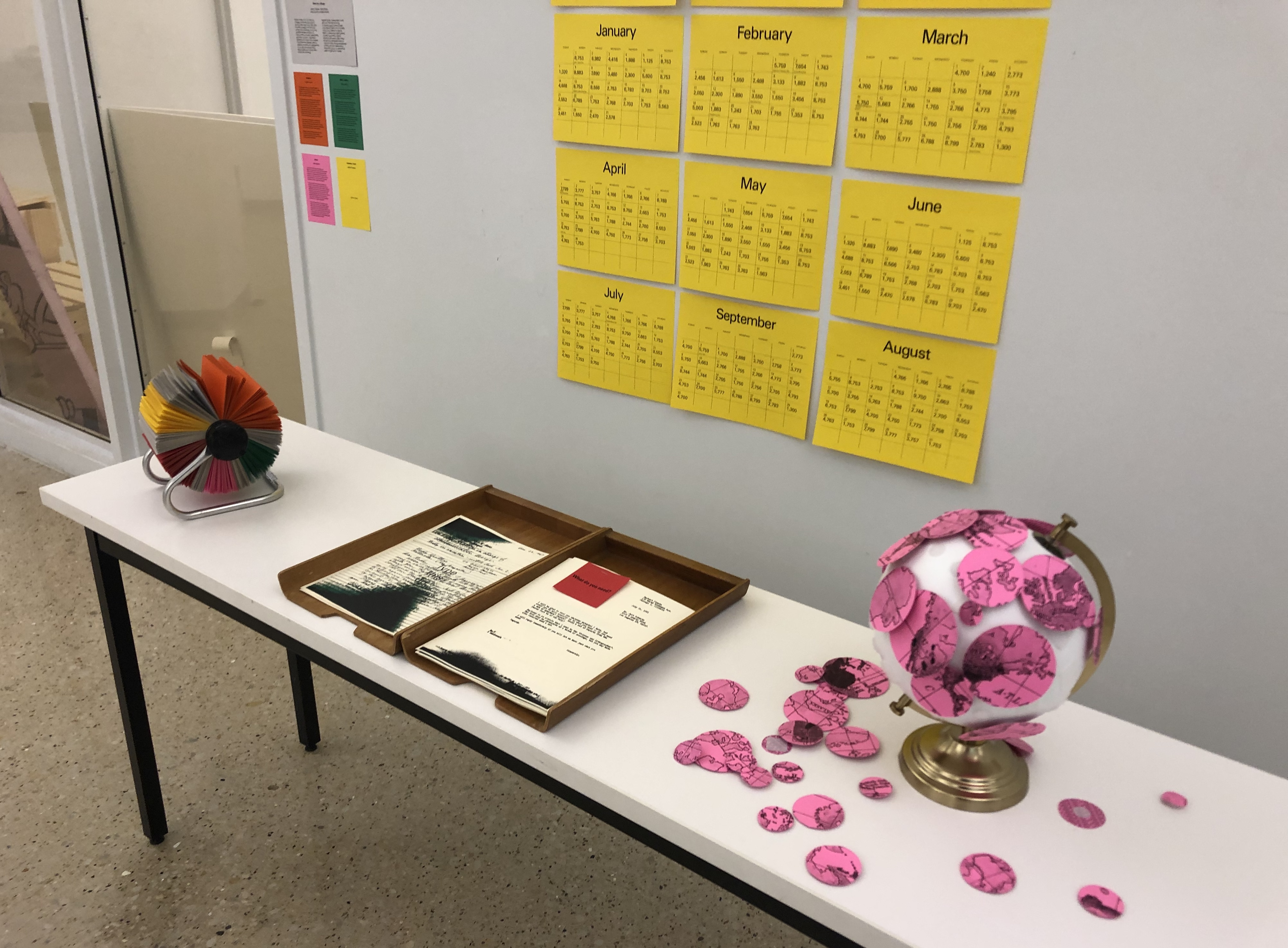
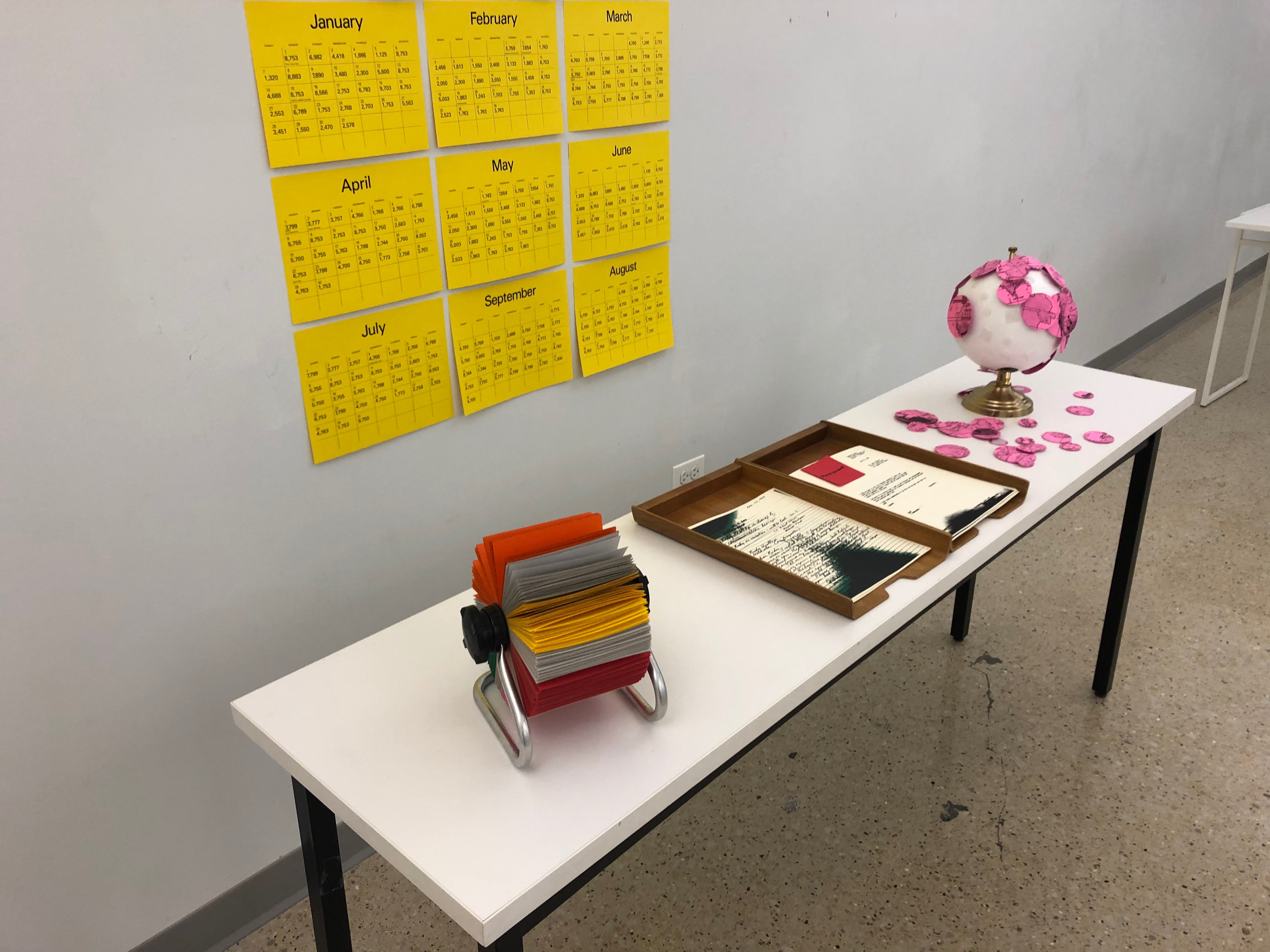
We decided to replicate an office environment, as understood through the archived material. Our installation, “The Desk as a Stage,” included a desk with a variety of symbolic objects commenting on the networks and correspondence of the IDCA conferences. Our design interventions subverted the forms of typical office objects and allowed a new dialogue to take place. Our design installation fulfilled several goals: to reveal the hierarchies of the IDCA Conference by studying the people and addresses connected to attendees, speakers, and conference organizers; to subvert the form of the office objects to convey information outside of their traditional usage or function; and to infuse our own critical narrative through designed objects and interpret the archived materials through the language of specific objects.
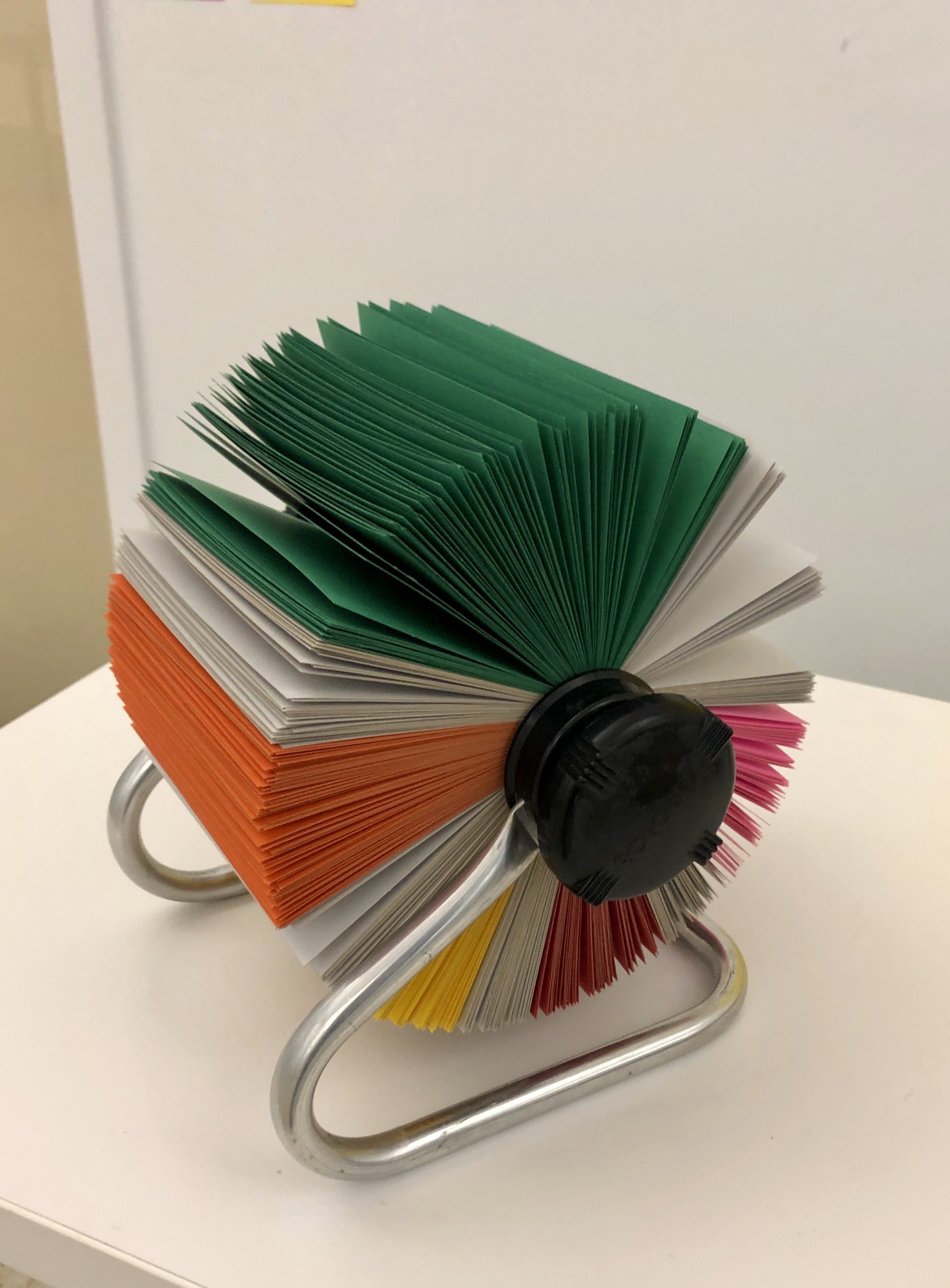
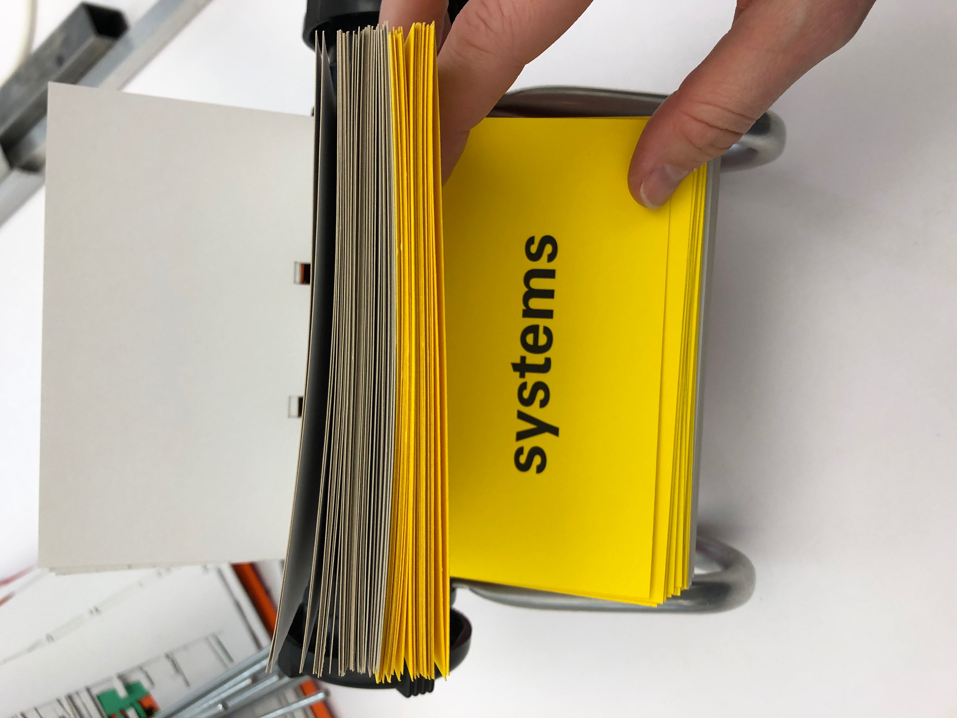
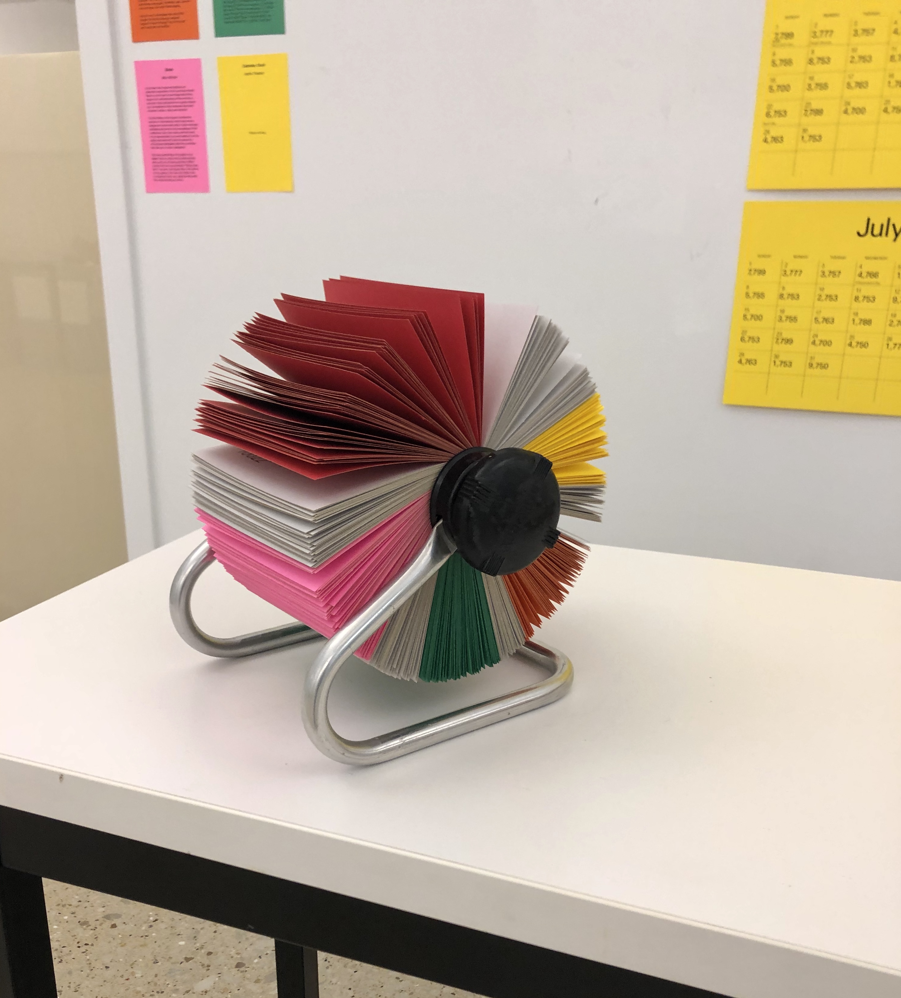
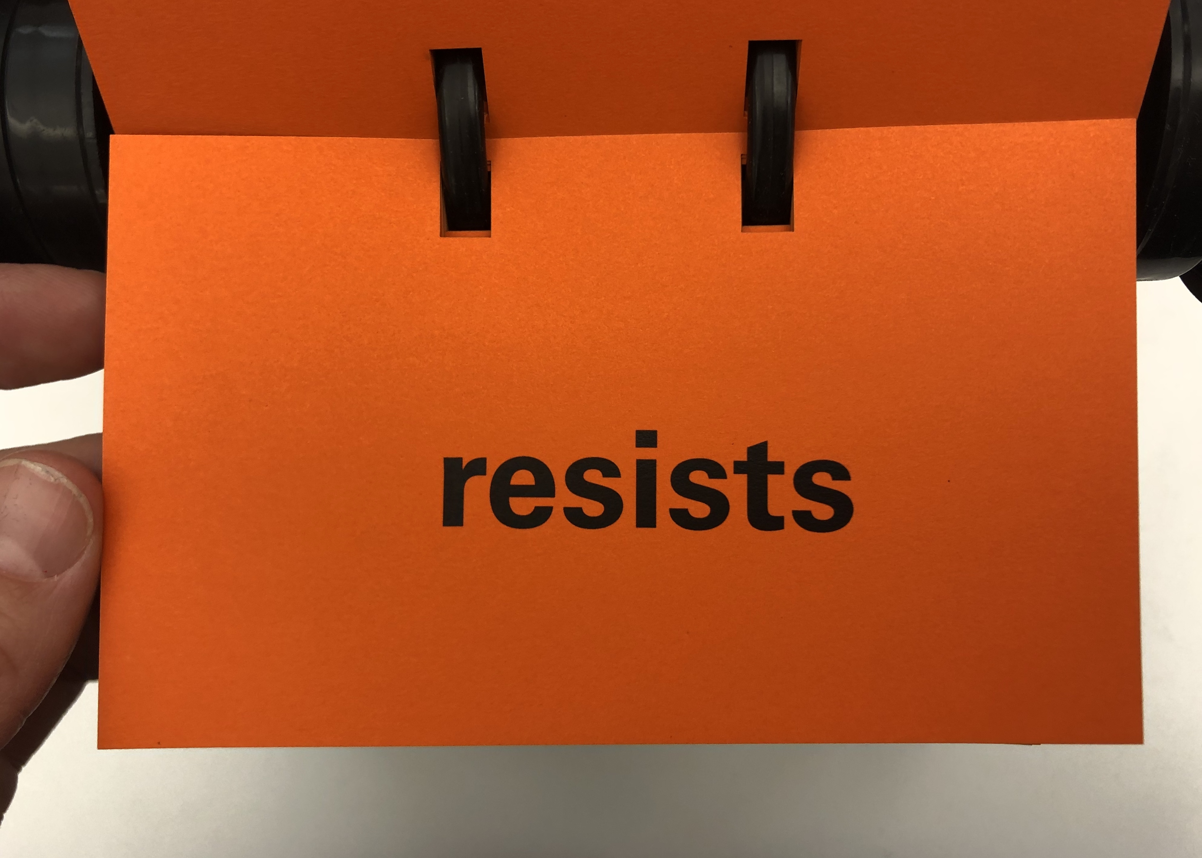
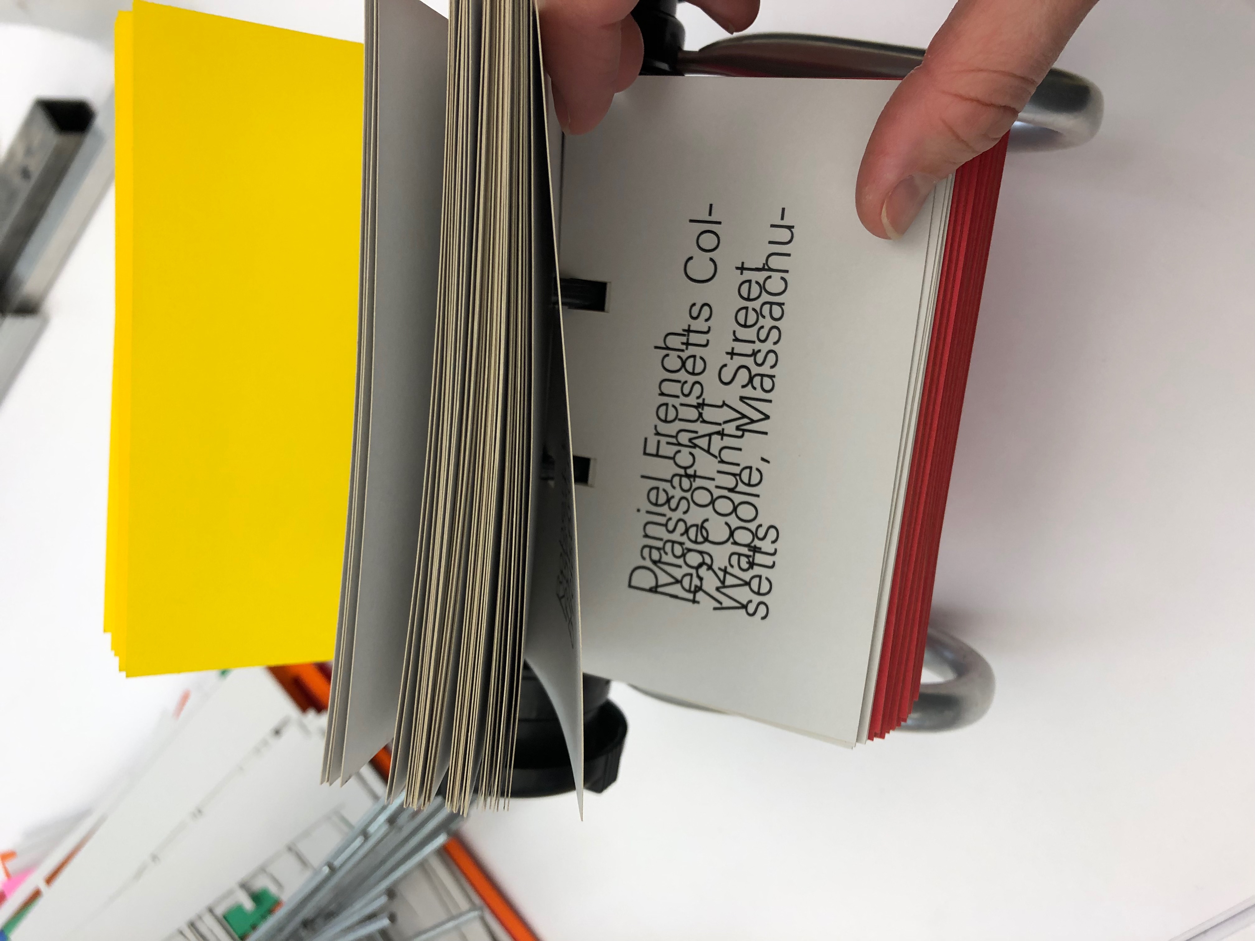
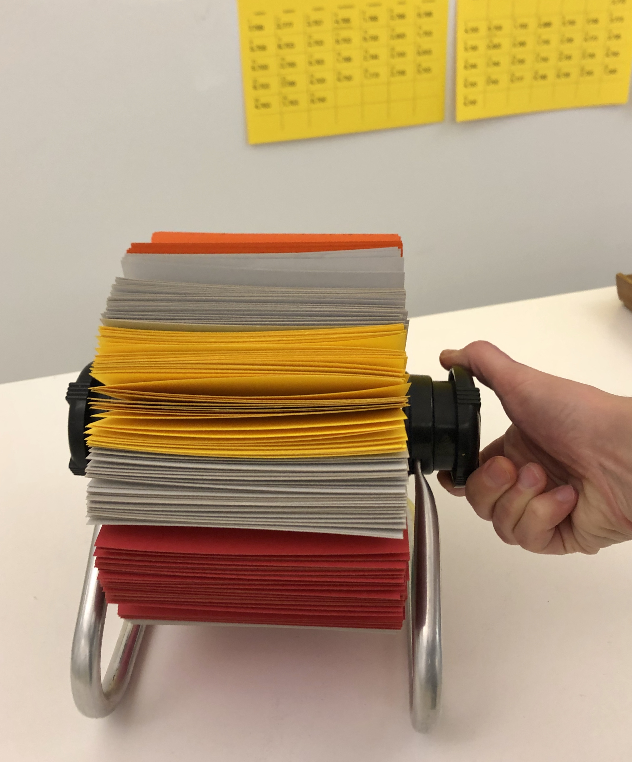
The first object on our desk, the Rolodex, exists as a physical object of organization and also as a symbol of a social network, a visual representation of one’s sphere of influence. While a typical Rolodex would include a straightforward collection of contacts, each card associated with connection and power, the one we have designed subverts this purpose. Our Rolodex aims to interrupt the hierarchy and network of those associated with the IDCA: executive board members, speakers, attendees, students, secretaries, and others. These contacts become a homogeneous, grey, jumbled mass of information, a contradiction of the organized system or network that the Rolodex represents as an object. We also aimed to critique the technologies of networks—how the Rolodex is a closed circle, much like our current social media platforms of today.
We used colored cards to infuse our own statements into the content of the Rolodex. When turning through the Rolodex, one can unveil underlying messages, questions, and themes connecting to the other desk objects. When interacting with our designed object, one can contemplate the role of the insular, hierarchical design network forged in Aspen through “word of mouth” and corporate connection. In fact, one page that we found among the archival materials stated “those who attended the 1964 Design Conference heard of the IDCA through the following media: (1) Newspapers & Magazines...17%; (2) Direct Mail...10%; (3) Word of Mouth...58%; (4) Organizations...15%.”
The next object, the globe, invites participation from the spectator. Like the Rolodex, it implies that our worldview is based on power and relativity—imperfect, exclusionary, and often very fragile. In our installation, the map has been split apart into segments that defy the typical
boundaries or borders of country and continent. Participants are invited to construct their own geography, to select map segments and adhere them to the globe as they see fit. Browsing the IDCA archive, we were able to identify several areas of concentrated interest, where conference participants and speakers travelled from. The design world of the 1950s and 1960s centered on American hubs as well as Western Europe. Other areas were sparsely represented. In the same way one might identify an area of “value” by the representation in the archive or conference, we invite participants to construct their own geography based upon their own whims. The globe is an implication of future plans, it is a reminder of one’s place in relation to another’s. It is an invitation to stake a claim.
The inbox and outbox contain actual correspondence unearthed from the University’s archives, giving viewers of the installation an opportunity to interact first-hand. Our intention was to reveal the invisible labor of a secretary, the underlying mechanism without which these yearly events might not have come together. In an archive, the only names that appear are the names that are written; a symptom of erasure as time passes. However, who was carrying out these tasks that were asked of these men in power? This is a masculinist symptom of history that we wanted to investigate and encourage the viewer to consider: whose names are not there? Who is not included in an archive?
Through our imagination, we explored the relationship between a secretary and the boss; it is two-fold. Firstly, we imagined a relationship—management style—that would be top-down, the boss receives the correspondence, and delegates to the secretary. The secretary is given only the information needed to complete the task. This is seen through the design act of redacting information (with the color green). Secondly, we imagined a relationship where the secretary acts as a filter for the boss, being trusted to take care of the mundane, day-to-day, but not participating in the more visionary discussions, seen in the red correspondence. In both cases, we see a pattern of Durkheim’s functionalism , where interconnected parts work together in 1 “harmony” to maintain the whole. People are delegated to certain areas of work due to personality or perceived ability. These characteristics, however, are largely intertwined with race, gender, and class and is used to uphold systems of oppression.
The installation extends beyond the items on the desk, to include a wall calendar. The calendar investigates the “time is money” trope, offering financial statements, taken directly from IDCA correspondence and records, in lieu of actual dates or tasks. The calendar itself is a to-do list through time, a system of organization and reminders.
Looking through the material remains of the IDCA archive at Daley Library Special Collections allowed us to envision material forms and platforms with which to comment on the underlying historical evidence. Investigating these types of documentation and exploring material, paper records, were critical to our design process, and to our explorations of material form.
Collaborators: Hilary Short, Max Kleiner & Astha Thakkar